Eazier
Branding, graphic design and website development for Eazier
A bold new identity and website for Eazier. Typeface brought together a distinctive wordmark, a lively colour palette and a flexible visual language, carrying the brand through to the website and supporting social creative. A connected approach that gives the agency a recognisable presence wherever people encounter it.
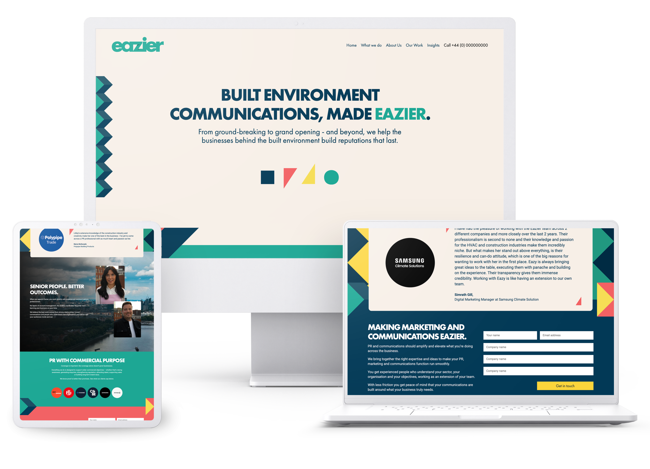
The website
The Eazier website brings the new identity into focus. Bold typography, generous space and colourful geometric details give the pages character, with a clear hierarchy that keeps the content easy to follow.
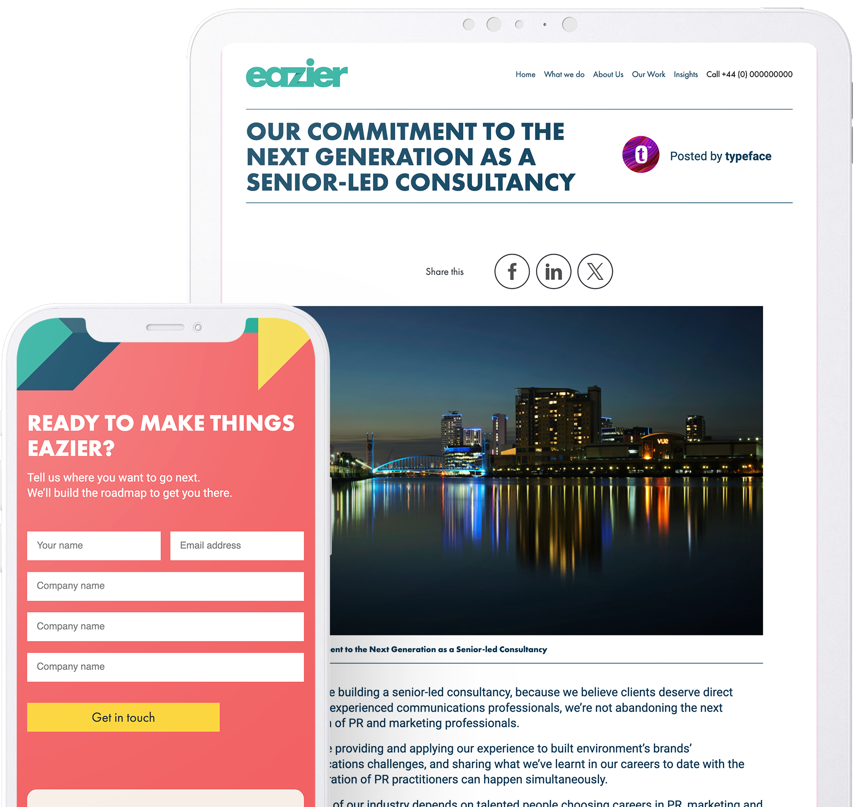
Typeface developed the website to carry that visual language across desktop and mobile. From agency information to insights and contact points, the brand runs through the experience, giving Eazier a consistent setting for its expertise and a clear invitation to get in touch.
Visit Eazier
The brand
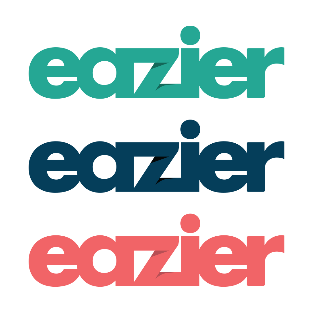
Confident, colourful and approachable. The Eazier identity centres on a bold lowercase wordmark, with closely connected letterforms and a folded detail in the ‘z’. That angular interruption gives the logo a distinctive feature, balancing the softer curves of the surrounding letters.
A palette of teal, deep blue, coral and yellow gives the brand plenty of scope. Softer neutral backgrounds provide breathing room, while the brighter colours bring emphasis and energy to the wider design.
Bringing it together
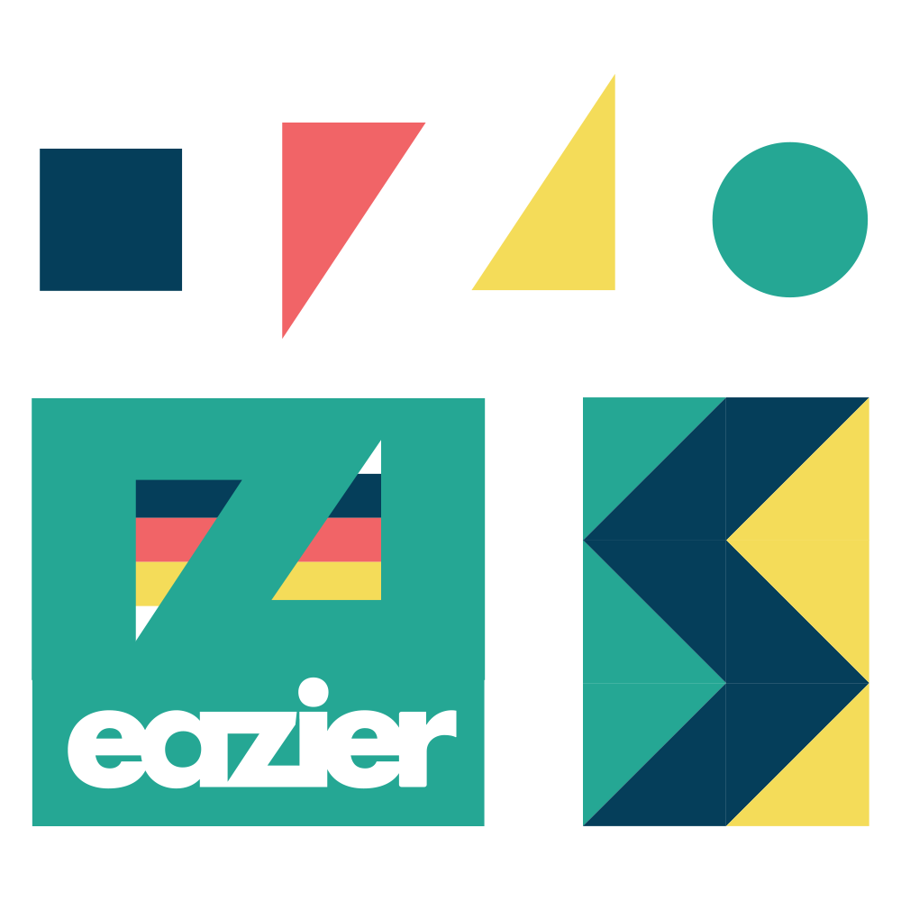
The identity extends beyond the logo. Geometric shapes, folded forms and repeating patterns create a graphic language that connects the website with the supporting creative. Used as borders, accents or larger areas of pattern, these elements give the brand variety while keeping a familiar visual thread.
Typeface brought these details together with consistent typography and colour combinations. The result is a brand with room to adapt to different content and formats, while remaining recognisably Eazier.
Social and monogram
A compact Eazier monogram gives the identity a presence where space is limited. It provides a recognisable mark for profile images and smaller applications, complementing the full wordmark.
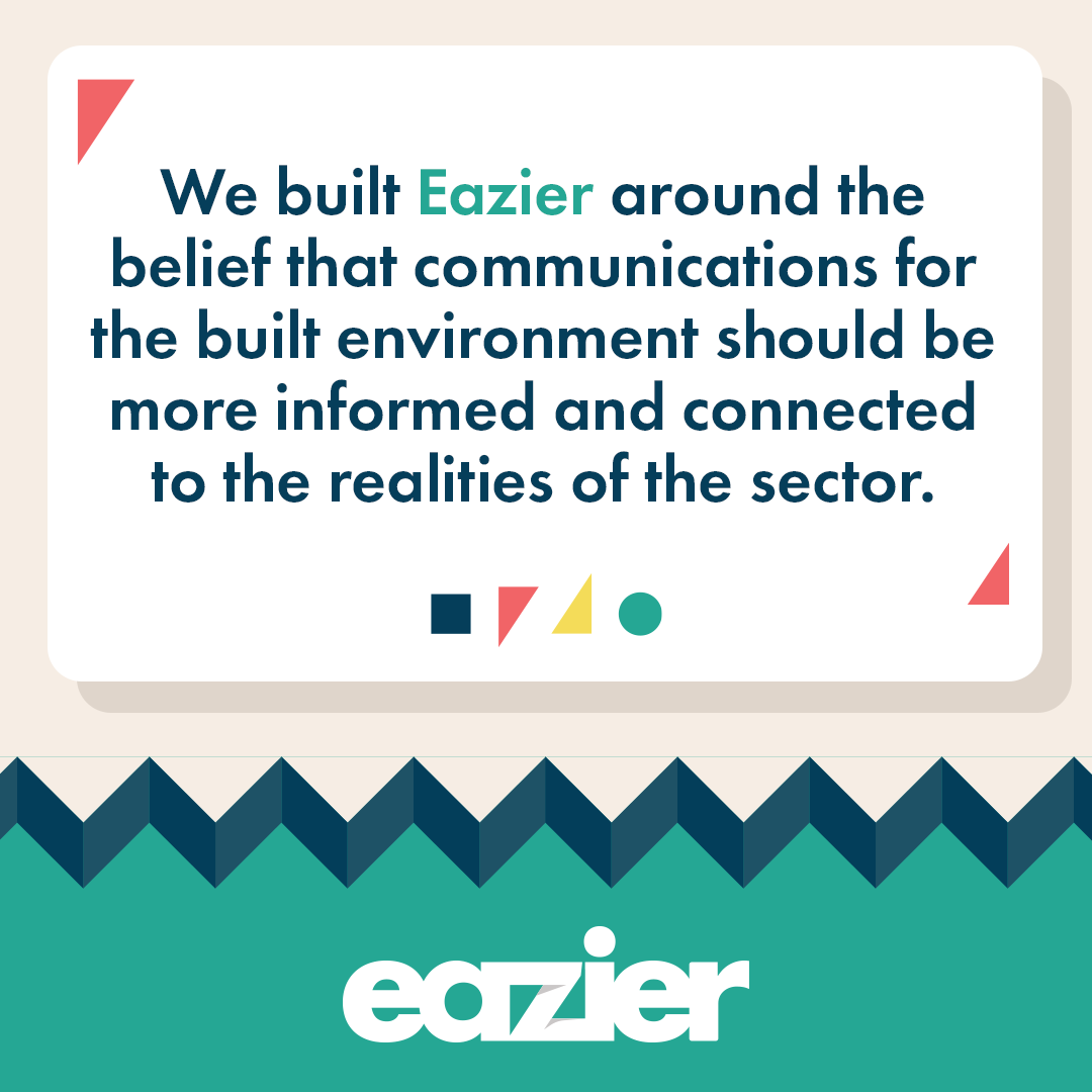
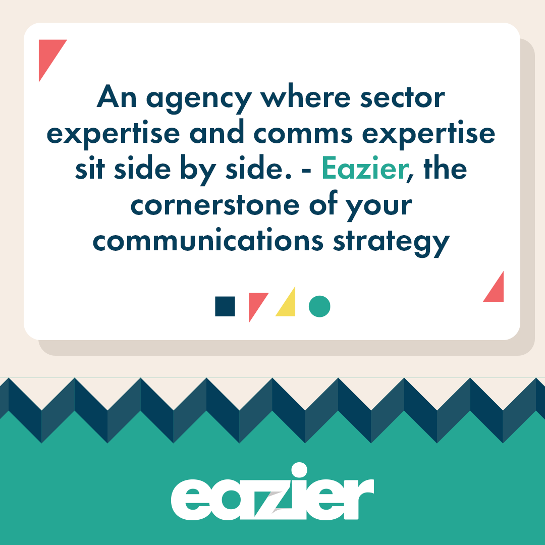
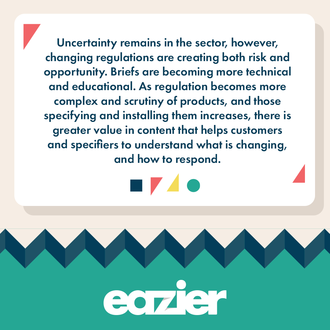
The supporting social creative carries through the same colours, typography and geometric details. Clear text panels give commentary and insights room to breathe, while patterned borders and bold colour blocks connect each post to the wider brand. A consistent approach with enough variety to keep the content fresh.