Whitworth SEO
A new website and a refreshed brand direction for Whitworth
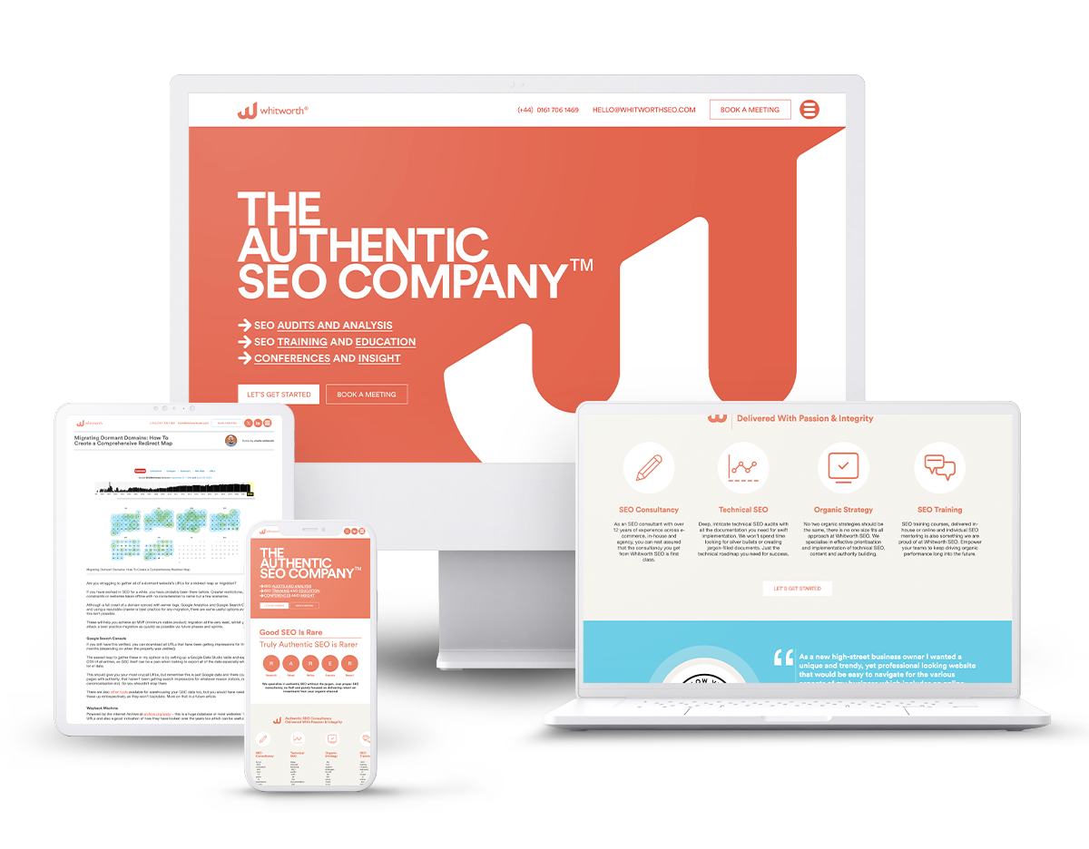
A refreshed brand direction and a new website for Manchester agency Whitworth SEO. With a refined colour palette, refreshed logo and a bespoke WordPress build.
Refined and confident
The new Whitworth brand is refined and confident. Typeface has developed a solid design language that’s easy to replicate across print and digital. A confident repositioning and a solid foundation for great things to come.

The logo
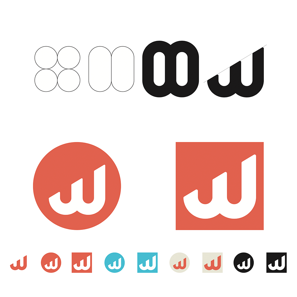
The new Whitworth monogram keeps the original’s vertical lines as its basic shape. Typeface has produced a well-balanced, pleasing graphic that can fit in to a variety of situations.
The Whitworth word mark takes the monogram’s diagonal shape and repeats it with a pleasing interaction between the ‘r’ and the ‘t’.
A brand made real
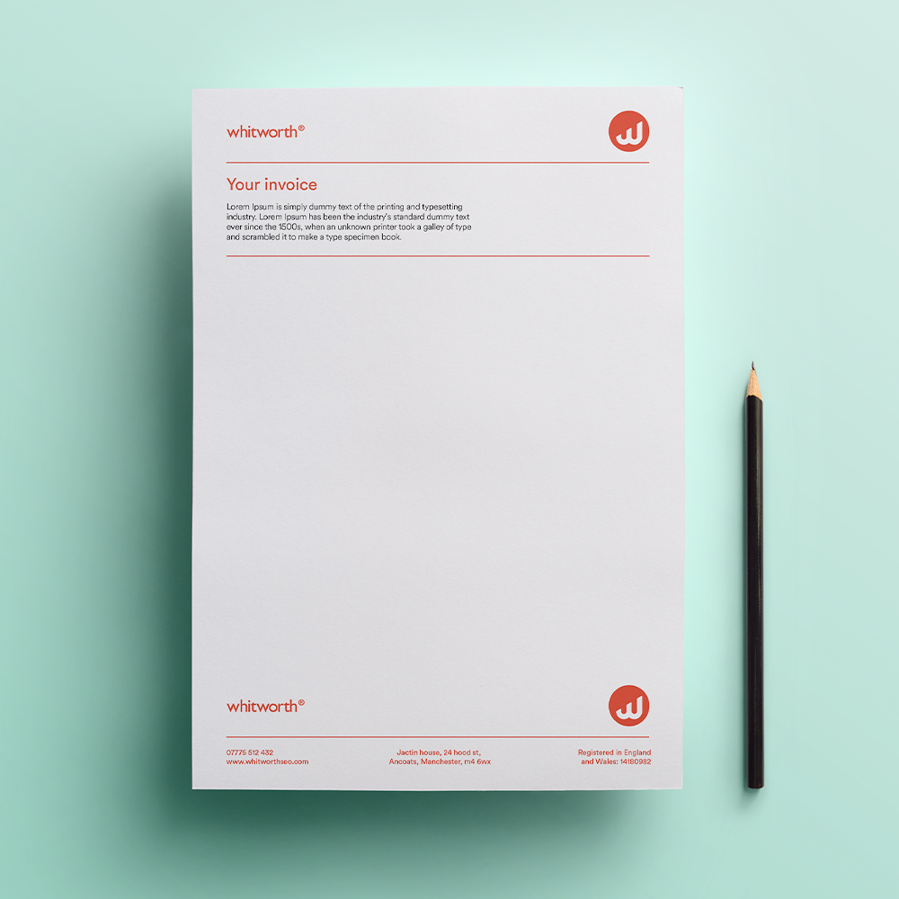
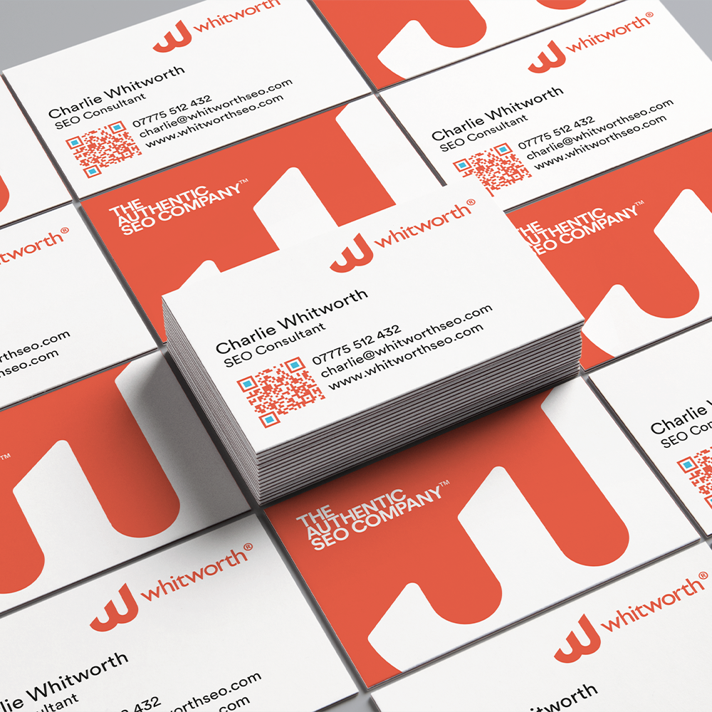
Typeface has applied the new Whitworth brand across digital and print to produce something that’s recognisably ‘Whitworth’.
A solid foundation
Solid and repeatable is the aim here. The Whitworth brand takes its cues from classic Swiss grids, sans-serifs and soft, geometric shapes.
The end result is confident, well balanced and simple.