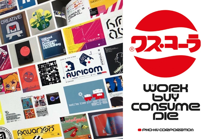

The Designers Republic are somewhat legendary. The Sheffield studio had a look and a style that shone through their work. Confident architectural shapes, thick lines, constrained abstracts and a very modern almost Japanese asthetic. While the studio itself closed doors in 2009, their work which spans back to the late 80s, still looks fresh. They worked with Aphex Twin, Pulp, The Orb. As well as brands like Adidas, Nokia and MTV. The impact that Designers Republic had on the way the 90s looked can’t be undersold and the influence they’ve had on today’s designers runs deep.
Back in 1995, Sony began their quest towards world domination, placing PlayStation kiosks in dance clubs across the UK in a very targeted marketing campaign. This was a brave move, they were selling to a hyper-aware audience, quick to react to and to define trends. Importantly, this was a market that could smell bullshit. What Sony shipped in the demo kiosks was a genuinely exciting new experience that made full use of their new PlayStation hardware. However, while Wipeout was a technical masterpiece at the time; there are arguably more enduring aspects that define it as a cultural touchstone.
Firstly, Wipeout didn’t just take influence from the UK club scene: It took the UK club scene. Music supplied and produced by Orbital, Leftfield and Chemical Brothers was presented alongside futuristic 3d visuals, twisting and winding tracks. A truly visceral experience.
But there was something else there, under those flashy graphics, independent of the music and the visuals. A genuine beating heart that also had its roots in the UK club scene, that came from Sheffield design studio, Designers Republic.
It’s interesting to compartmentalise Wipeout. You can split it easily in to the music, the visuals and that other thing. The thing that makes the experience complete, that you can’t quite put your finger on. This game just looks great. Every part of it looks great. Everything belongs and nothing looks out of place.
Brand languages
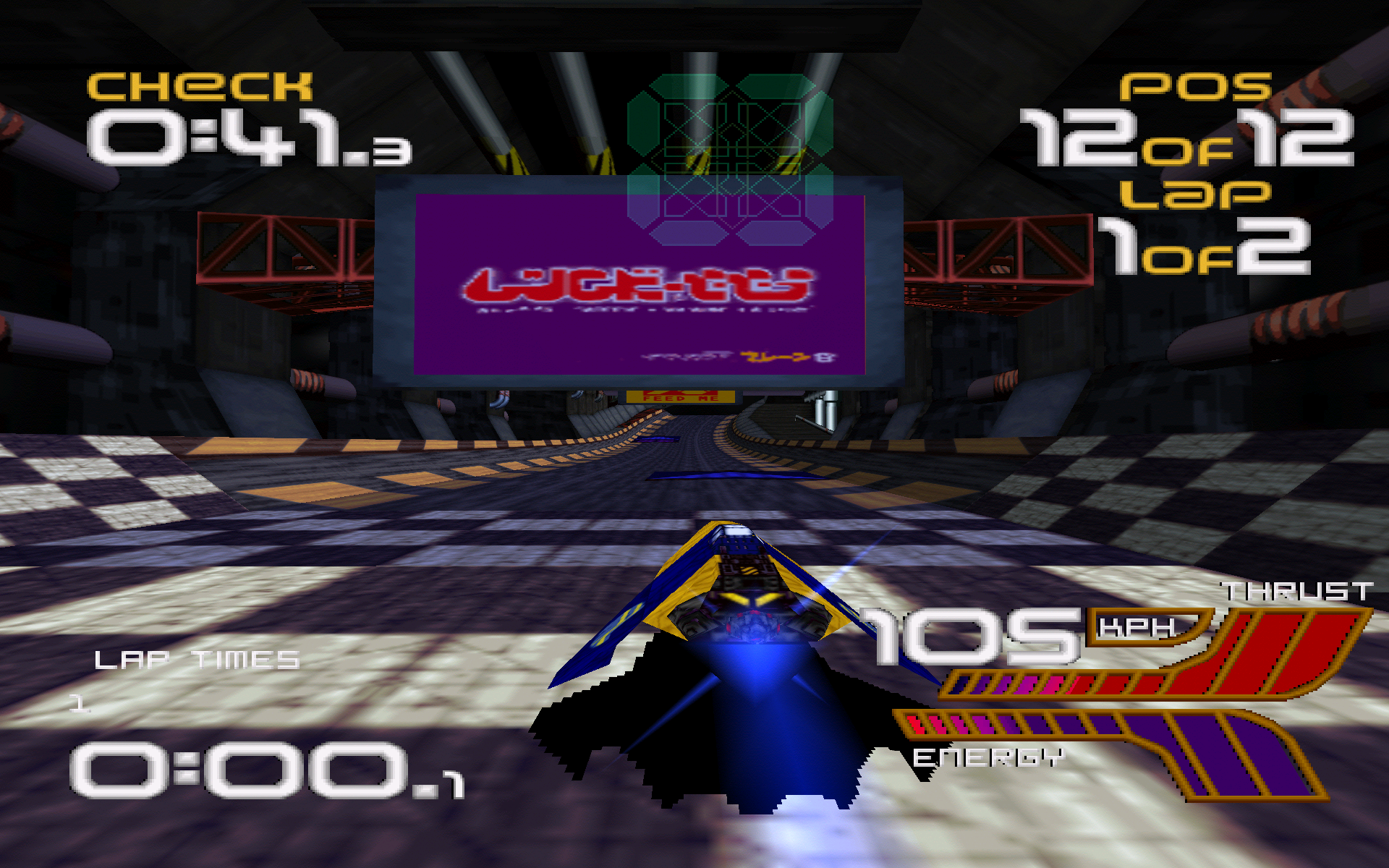
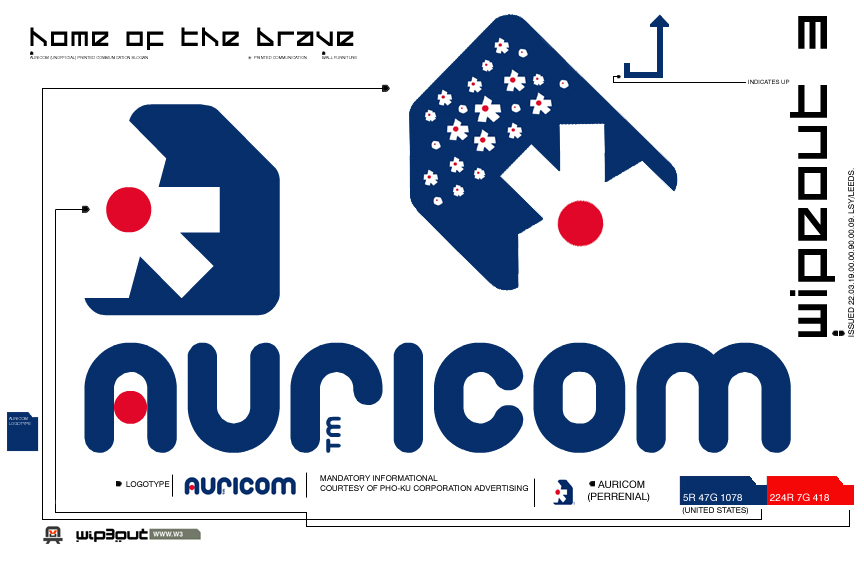
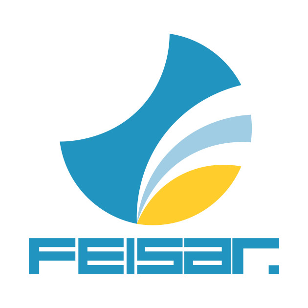
Liverpool based developer Psygnosis asked Designers Republic to produce a series of brands for each of the games futuristic racing teams. Each team would have its own logo and brand language, this follows through to trackside advertisements sponsor logos and background billboards. In fact, each track is littered with adverts for in game teams and fictional products alongside real world Red Bull adverts. This is branding at it’s best, the fictional made tangible and relatable.
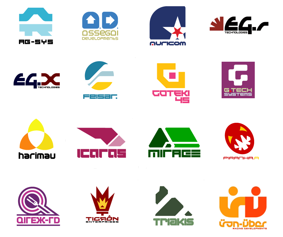
It’s this care and attention to detail that grounds the experience, creating a universe and a language that doesn’t need to be explained; it just exists. This is F1 with hovercraft, it has no story but the setting is established and the experience is rich. Wipeout is peak Designers Republic; it’s confident and bold, it references its pedigree and it has an ordered, other worldly feel to it.
Legacy
Designers Republic has a legacy that spans decades, genres, disciplines and media. But it’s their influence on the sport that they referenced 22 years ago that Typeface finds most interesting.
Wipeout came out in 1995, it was a snapshot of the future. Fast, smooth racing, pounding beats and slick graphic design. It referenced F1 and the brand language that surrounds modern teams and sponsors. Now either Designers Republic had the foresight and vision to take modern F1 branding to its logical conclusion, predicting the future only a couple of decades early. Or contemporary sports teams and brands are looking towards video games and esports to stay visually relevant. Here is the 2017 Formula 1 rebrand. It’s very slick.
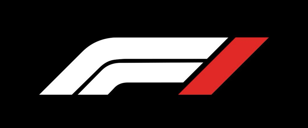
And here’s the typeface, F1 Regular.
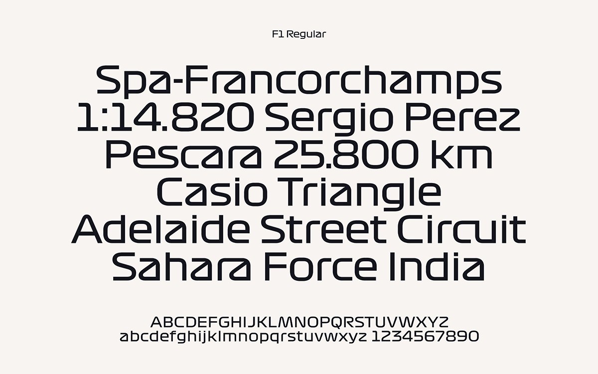
It’s not unusual for a brand to have its own typeface. With the saturation of high resolution screens on even mid range laptops, mobiles and tablets; brands are able to invest in and re-use high quality assets like custom fonts. The F1 font is gorgeous. Angular, architectural and kinetic. It’s familiar though, which starts to make sense when you deconstruct it.

The above is the typeface used in Wipeout. In menus, on screen text and background imagery. Produced in 1995 by Designers Republic. This is used at the very basic level of interaction, before we even get to see the hovercraft, the sponsors and the brand languages. Before we even get to race.
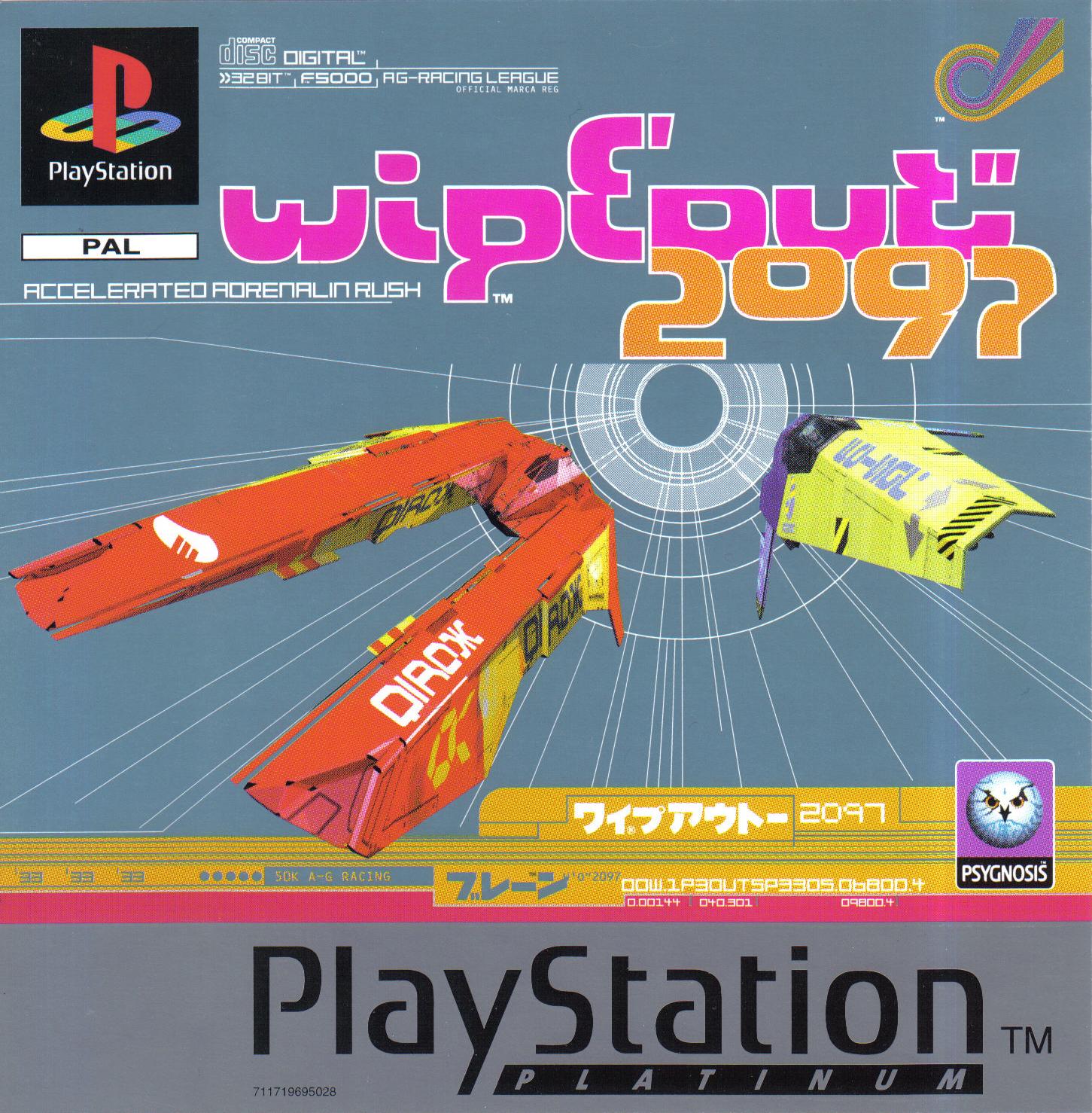
This is the typeface used on the cover of the box that the game came in, and it perfectly describes the content contained inside.
There is a very special breed of artist that can follow something to its logical conclusion. Almost seeming to predict the future. Graphic designers should be able to produce work that both references the past and looks towards the future. Enduring work that inspires trends doesn’t have to rely on them if it’s aware of its audience, how they react and where they’re going.
Designers Republic may have closed their doors, and Wipeout, while still a great experience, looks tired and is very much a product of its time. But the work produced by Designers Republic still looks unique and it still inspires modern brands, aesthetic and today’s designers.
More Reading
Graham Smith at The Logo Smith has written a great article that delves in to the history of the Wipeout logo, which you can read here.