
Typeface has recently completed a project with Brooke. Originally the brief was to produce a series of colourised images for Brooke’s social media channels from their extensive archive of WWI imagery. As work progressed it became clear that this was more than fodder for social media channels, it became a series of creative assets that the charity has complete ownership over, and something that its audience continues to engage with on an emotional level.
Brooke has an enviable social media presence that consists of a very passionate, educated and engaged audience. Typeface wanted to create something for them, to highlight that the work carried out by Brooke is just as important 100 years after the charity was founded. Typeface took assets from Brooke’s archives and adapted them to the way we now connect with the past, and the way we consume media.
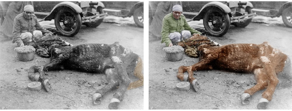
The concept itself was simple. Black and white images have a nostalgic quality that can make them difficult to connect with. Adding colour to the subjects while keeping the rest of the image intact helps to remove the subject from the past. Clothes that looked old suddenly look fashionable, skin tones pop and, importantly, to the viewer the subject becomes much more real and much more relatable.
Like all good design, the method is simple. Colour is painted on to the original photograph using a steady hand, a pen and tablet. Skin tone and shading is a quality of the original black and white image; the brain merges tone and colour and presents something that our eye sees as normal. Each image contains no more than four flat colours, but the end result is powerful because the subject has a story to tell.
Respect is earned
It was important that Typeface invest thought in to the most respectful way to treat these images. If a human is interacting with an animal then both subjects are colourised to highlight the bond that comes from relying on each other to such an extent. Out of respect, the decision was made to not completely remove the subjects from their past, and so colour fades back to black and white wherever feet touch the ground.
Simplicity is confidence
With a simple idea well executed; the finished creative ended up being a very emotive project to work on. Brooke now has a collection of powerful imagery to share. Out of the archives has come some fantastic creative assets that need no explanation, something a modern audience can quickly understand and connect with.
While the brief didn’t change, the scope of the project itself widened. Originally a series of simple images to share over social channels, the project has inspired the media team to use these solid creative assets in their centenary celebrations. Typeface produced two colourised images of founder Dorothy Brooke, and after consulting their empassioned community, Brooke have turned one of them in to a limited edition print for purchase on their website.
The Dorothy Brooke print is available to buy here, all proceeds go towards the Brooke charity.