I had my professional headshots taken by Chris Ball. He’s a fantastic portrait and advertising photographer with a very distinct style; he balances technical quality with the artistic knowledge it takes to get the best out of his client.
Being a great photographer isn’t about having all the best kit or knowing how to use every feature on the camera. On the other extreme it’s not about having an encyclopaedic knowledge of composition or a library of Ansel Adams landscapes. It’s about knowing what needs to be communicated and understanding the process needed to achieve that result. Great photographers craft images by manipulating their environment and showing the audience what they see.
Chris has produced beautifully-lit, technically brilliant automotive work for the likes of Mercedes Benz and shot numerous commercial lifestyle and advertising campaigns for the likes of Network Rail and Petronas. You should definitely check his work out.
So, why is a graphic designer talking about headshots in an article about a painter?
Because I chose Chris for two reasons:
One, I understand how he works and the care he puts in to his work. He brings his canvas with him and plans his tools for each shoot.
Two, I wanted a particular style of image.
I wrote about the differences between artists, stylists and designers from a design perspective in the ‘What’s your aesthetic‘ post. I’ve also written about the creatives who influenced me over the years, including Tracey Emin, Andy Warhol, The Designer’s Republic. And at some point I’ll finish that article about my biggest influence, Paul Rand.
But this is about local working class hero, artist Laurence Stephen Lowry.
Technically, brilliant
Like Picasso, Lowry was an accomplished artist who later developed his own style. There’s a theme with creative people; they quickly learn the rules, then they spend the rest of their time either trying to bend those rules, or subvert and repurpose them.
Blurring the lines
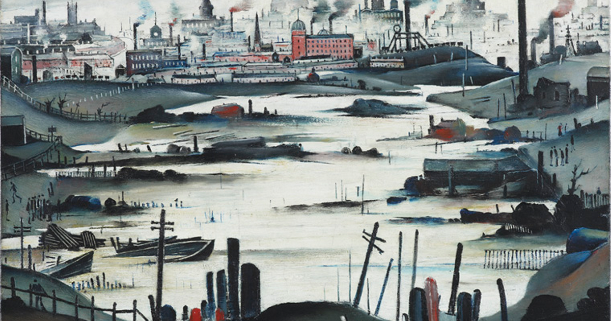
I see Lowry as an illustrator who used urgency and texture in his images. His pencil drawings look quick and rushed, the closer you look at them the more you’re drawn in and the longer you spend with one of his images the more you realise how layered and careful they are. Made up from small flicks and careful strokes that look fast and messy from a distance, yet have too much detail and commitment behind them to be thoughtless.
Canvas and paint have a very special relationship, Lowry embraced this in his paintings. He knew how his tools worked and he produced simple but effortlessly detailed images with careful, layered pencil and brush strokes using the texture of his canvas and paper to add weight. That connection to his canvas especially comes through when he chooses to use oils, it helps give movement and life to his work.
Lowry understood his tools and he used them in sympathetic ways.
His method makes sense if you compare him to painters like Jackson Pollock. Both Lowry and Pollock used knowledge and mastery of paint to add depth, texture and a sense of movement to their work in a way that nobody else could. Like a Pollock, a quick glance at a Lowry and you might think ‘I could do that’. That’s a fair assumption for a lot of people to make, but it comes from a place of seeing the end product and that simplicity coming forward from chaos and complexity. That effortless child-like element to Lowry’s works is not a simple thing to achieve, it takes decades of experience.
“It took me four years to paint like Raphael, but a lifetime to paint like a child.” – Pablo Picasso.
Some of Lowry’s paintings use colour and texture that can’t be replicated on a screen, you have to see Head of a Man in person to appreciate the contrast between the tired reds of the eyes, those rough white highlights, flat skin and that deep blue opulent background.
It’s also fair to say that you’ll never get the best out of a physical image when viewing it on a screen. Pollock’s work is impossibly complex, layered, huge and intimidating. It should never be judged as a thumbnail on a screen. Lowry is similar. His seascapes will swallow you up, some images are small and humble and invite you to move closer, some are funny, most are honest but they all have to be seen in context to be appreciated.
A product of his time
Using bold contrasting colours to pick out features that other portrait painters wouldn’t usually draw attention to. Dark shadows, gaunt faces, tired eyes. The end result could be honest, sometimes grotesque and sometimes difficult to enjoy; but always interesting and often endearing.
You really have to see his work in context. While there are many private collections, Lowry created some 1,000 paintings and 8,000 drawings so you shouldn’t have to go far to see a Lowry for yourself. The Tate, London has 23 Lowry drawings and paintings in their collection, you can view them by appointment here.
The very best way to experience his work is by visiting the largest collection of LS Lowry works, owned by Salford City Council.
Previously it was housed at Salford Museum & Art Gallery, but now The Lowry collection lives in a custom built art gallery and theatre; The Lowry in Salford. The Lowry is home to a collection of over 400 paintings and drawings, as well as video, photos and very knowledgeable, friendly staff.
A visit to the Lowry is always recommended if you’re in Manchester. If you are in the area then speak to Typeface, I’ll be more than happy to take you around the gallery and share my own experiences of LS Lowry and his work.
If you’d like to support the Lowry centre by keeping our cultural heritage alive and accessible for the next generation of creatives to enjoy and be inspired by, then you should check out the pieces of work available via the adopt a Lowry programme.


