Typeface has been working with restaurant upstart Billy’s Burgers and Shakes since February. With a diner in Manchester and a larger restaurant opening in Bradford, there’s been lots of room for creative projects which have come together to create a solid, fun brand.
The new retro
Fashion moves in circles, so instead of looking directly to the 50s/60s for influence; Typeface has taken its inspiration from the 90s interpretation of 60s retro. After all, we’re as far away from the 90s as the 90s was from the 60s.
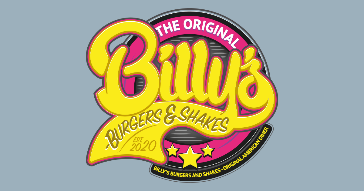
Developing the brand
Once the flow and shape of the letters was decided, they were redrawn in Illustrator and built in to a coherent icon. Because the logo is such a complex shape, Typeface created four variants ranging in simplicity.
Beyond the logo
Typeface created two custom 8x3ft wallpapers to dress a dividing wall in the new Bradford restaurant. The brief was to use modern, recognisable comic book characters, and to create something a little fun.
To emulate that 90s comic book style, pannels were drawn in pen and ink, scanned in and then vectorised and coloured. Very little work was done to clean up the images themselves to keep the hand drawn look.
Over the last 6 months, Typeface has created signage, posters, bags, window graphics and wallpapers. If you want to see the progress on the Bradford store, follow Billys Burgers and Shakes on Instagram.

