
Crichton is rarely subtle in his themes and texts. He’s a methodical author, who builds believable worlds and uses a ton of research and knowledge to do that.
Spielberg, on the other hand is an emotional architect. He knows how to connect with his audience on an empathetic level. He understands spectacle and he knows how coax our inner child out.
I feel that Jurassic Park the movie manages to communicate aspects of Crichton’s philosophy and themes perfectly, in a concise understandable way. It does that by dropping the audience in to its world, it doesn’t over explain things. It shows.
Yes scenarios were removed from the book for the movie. For the sake of hitting story beats and moving things along, some characters were blended together. As a fan of the book as well as the movie, it’s difficult to ignore Spielberg’s treatment of Gennaro, which was borderline criminal. But it’s also important to see the movie and book as completely separate texts.
We could talk about the second book, and how the author was reluctant to write a sequel. We could talk about the modern sequels and how they tease that satire of corporate over consumption, a lack of new ideas and fast fashion but don’t quite hit the mark. But instead let’s just talk about a graphic designer’s love for Jurassic Park in its context.
It’s 1994
I fell in love with Jurassic Park, like every other 12 year old because dinosaurs were cool. I feel it’s hard to explain just how cool dinosaurs were to a kid in the 80s, dinosaurs were fresh.
This was the first movie I watched multiple times at the cinema. I remember my Grandad taking me, and then my uncle, and visiting the little cinema in Wincanton on my own for the first time so I could see it again. Dinosaurs were cool, but this was something else. There was an undertone that I really enjoyed, it was a package, an experience. For two hours there was no question that this world existed, it was real and believable.
From a film perspective and at its core, Jurassic Park works for four reasons.
- The story carries a moral philosophy and it contains that classic warning of man’s hubris. Who doesn’t love that?
- We follow a group of innocents against an unstoppable natural disaster, but something entirely avoidable.
- This is a classic horror film on par with Alien and The Thing. And we see it through the lens of Stephen Spielberg at his peak; he just gets it, he understands how to create movies for people. Movies that scare adults and children can lose themselves in.
- Finally, it looks the part.
The scene that explains the phenomenon
“Before you even knew what you had, you patented it and packaged it and slapped it on a plastic lunchbox, and now you’re selling it, you want to sell it.”
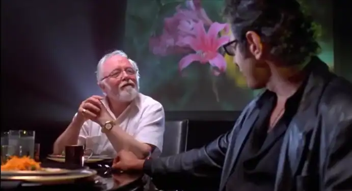
Ian Malcolm, the audience’s cynical voice. If we see Jurassic Park’s spectacle and horror through Lex and Tim’s eyes, we question its morals through Ian’s. That’s what the recent Jurassic World movies have tried to communicate, and it’s where they’ve all fallen short because Jurassic Park is sincere in its on-site gift shop, its lunchboxes, its t-shirts, its branded Jeeps, its signage, its typography and its prime Chilean sea bass.
It was all there in the background, it brought you in to its world and that’s what sold the idea.
Put simply, Jurassic Park is branding perfection. It straddles the line of product placement and toy selling but it does it with a cheeky wink to its audience.
Come on, just look at that logo. No expense was spared.
That (damned) book cover
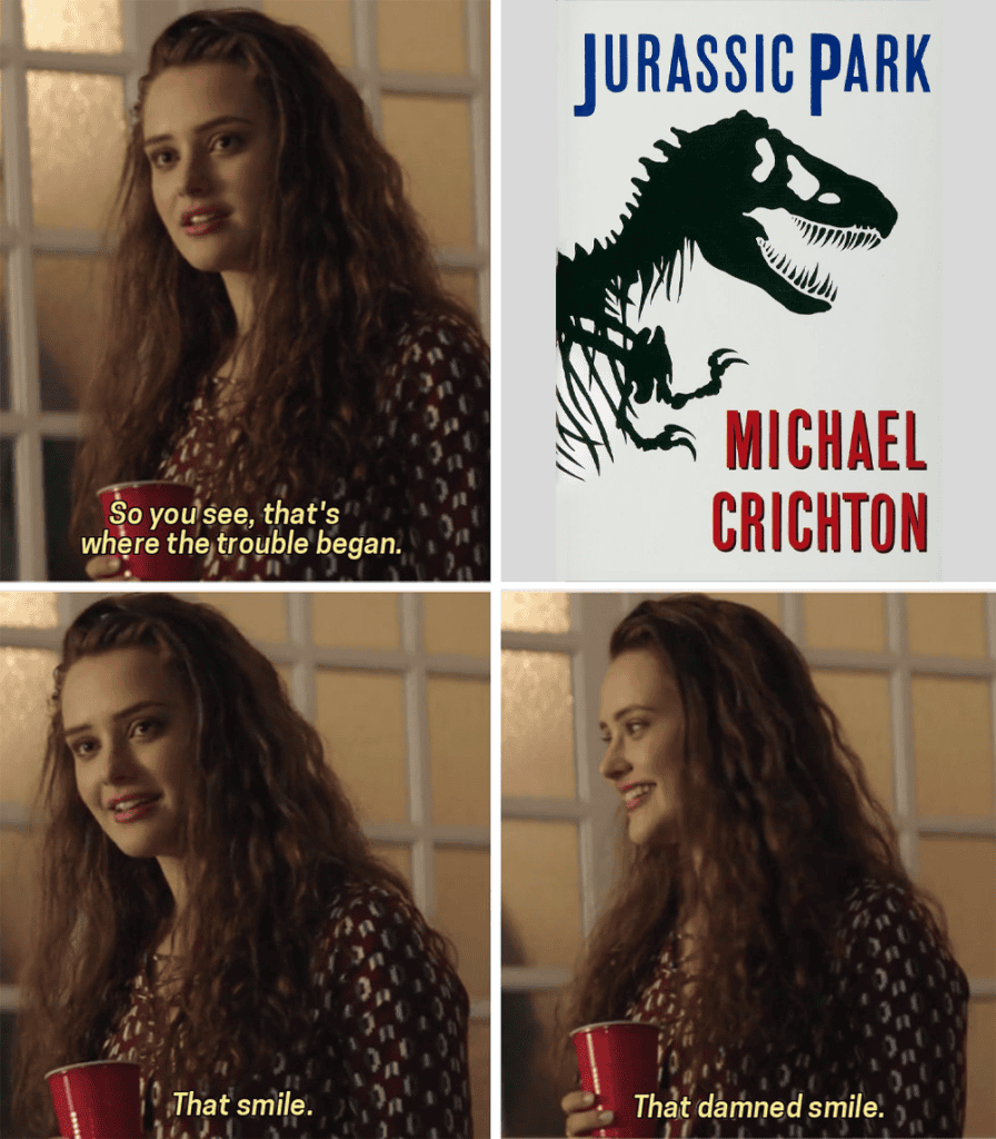
The Jurassic Park logo itself was a combination of the book cover designed by American graphic designer and book cover artist Chip Kidd in 1990 and designer Sandy Collora. Kidd is a prolific book cover designer, and a graphic design legend. Working for Alfred A. Knopf publishing house under the Penguin Random House umbrella, he’s designed thousands of book covers and has worked with authors such as Haruki Murakami, David Sedaris and Neil Gaiman. If you have a book shelf (and you should) then you have some of his work. Collora is no less prolific, having worked on Predator, the Crow, Dogma and Men in Black.
It’s hard to overstate how important the Jurassic Park logo is to the overall tone and feeling of the series. The idea that you shouldn’t judge a book by its cover is repeated a lot, but in the context of books that’s kind of the whole point. Books are sold on the strength of their imagery, nobody is taking a gamble in Waterstones on a random book unless it jumps off the shelves begging to be turned over.
The masterstroke for Jurassic Park was taking that image and using it to build out the visual side of the film. Production designer Rick Carter pulled together a coherent, believable aesthetic. Everything is branded in Jurassic Park and it all started with that perfect book cover from 1990.
A diegetic branding masterclass
Diegetic design in the context of movies is a design element or language that doesn’t just exist for the audience. It’s a living, breathing part of the world that characters are aware of and can interact with. Jurassic Park takes this further than most movies by having products on display to show its commercialisation of nature.
Design is an integral part of the Jurassic Park world. It doesn’t just exist as product to be purchased by excited moviegoers post-consumption; it’s something that the characters in the movie are aware of. The sinister undertone that no expense was spared is purely on a visual level, of course we the audience know that corners were cut, but not the things that mattered most to Hammond; presentation, visuals and experience.
Analyse the things you like and find out why you like them
Contrary to Jurassic Park’s core message, I do like to consume media. I enjoy rewatching too, to see what’s happening in the background or to interact with it again as I gain new context. it’s important that designers take notes from as many sources of media as possible.
Design knowledge comes as much from education as it does experience. Education is the foundation that teaches us how to interpret and learn, while experience is what shapes us; It’s what influences us and gives us perspective. As a media and film production student in the early 2000’s I was lucky to be exposed to media I wouldn’t have otherwise have looked for, it also gave me the tools to look at the things I loved and to understand why they resonated. As a professional graphic designer of over 20 years I constantly find myself looking at work outside the obvious design space to see why it clicks with me and to understand how it works using my context as a creative.
Starting a morally ambiguous dinosaur cloning park? I’m probably not the person for you, if you’re looking for coherency and brand thinking then you’ve come to the right place. Contact Typeface today.