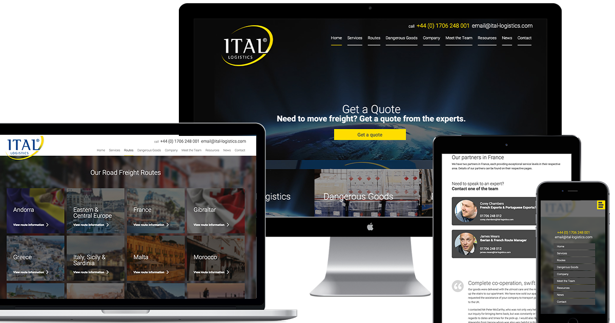
V6.0
The new Ital Logistics website is a landmark project for me; while Typeface is about to celebrate its third year in December, the original Ital Logistics website was my first professional project back in 2000. I’ve been designing and developing their web presence ever since.
Currently in its sixth iteration, ital-logistics.com has always aimed to be as informative as possible. Now the company enters its 20th year with a mature, informed online presence that reflects internal development, roots and confidence.
The choice to put staff front and centre is something I’ve been eager for, as it adds a level of professionalism and personality which has allowed me to be as minimal and clean as possible with design choices without creating a clinical experience.
Interesting times
Over the years as the company has grown, it became more apparent to me that the quality of the company and service had sidestepped and moved past the message and tone projected by the website. In order to realign, we needed to open up Ital Logistics, from the warehouse to the office; and to show as many faces as possible and answer as many questions as we could.
Having the opportunity to grow as a designer while a company like Ital Logistics grows in both scope and reach is quite unique. We both started at a special time where businesses were still trying to figure out how to use the internet. We’ve tried a lot and I’ve learned a lot with the Ital website, and I see this current version as the next stage in one 20-year-long project.
A companies biggest asset is its employees and when your company is made up of people with over a decade’s experience working with you, you need to let your clients know who they are. As much as it is a celebration of 20 years in business, this new website is also a celebration of the Ital logistics team.


